Does Money buy Baseball games?
- 31 minsBaseball and the Power of Money
In this project, we are going to look at some baseball data! We would like to plot and visualize data through Exploratory Data Analysis (EDA) and gain some insights about players, teams, and salaries through the years in baseball.
We want to understand how efficient teams have been historically at spending money and getting wins in return. In the case of Moneyball, the movie, one would expect that Oakland was not much more efficient than other teams in their spending before 2000 but became much more efficient between the years 2000 and 2005. We would like to explore this hypothesis through the data and many visualizations.
Install some packages
library(tibble) # for nice printing of tables
library(dplyr)  # data wrangling
library(Lahman) # baseball dataset
library(ggplot2)# pretty graphs and plots
Load the Data
The first thing that we have to do is load our data. We will do this using sqlite through the src_sqlite function.
lahman_con <- src_sqlite("/Users/yameri/mysite/yusufameri.github.io/_source/db/lahman2014.sqlite")SQL
There are a few different parts of running an sql query through R.
- First we define our query below as a string.
- Next we send that query to our connection (
lahman_con) and store the results in query results (variable). - Then we run the
collectfunction to force computation of lazy tbls. Run?computefor more information about why we do this and documentation.
# lets calculate total payroll per year for the Americal League (AL)
# save the query as a string
salary_query <-
  "SELECT yearID, sum(salary) as total_payroll
   FROM Salaries
   WHERE lgID == 'AL'
   GROUP BY yearID"

# send the query to the database
query_result <- lahman_con %>% tbl(sql(salary_query))

# at this point the query is not computed completely. To load the result
# of the query as a table in R use the collect function
result <- collect(query_result)
Another way of using SQL within R is using the RSQLite package. This package implements the core database API DBI for SQLite.
library(RSQLite)

lahman_con <- dbConnect(RSQLite::SQLite(), "/home/ids_materials/lahman_sqlite/lahman2014.sqlite")

query_object <- lahman_con %>% dbSendQuery(salary_query)

result <- dbFetch(query_object) %>% as_tibble()

head(result)
## # A tibble: 6 × 2
## yearID total_payroll
## <int> <dbl>
## 1 1985 134401120
## 2 1986 157716444
## 3 1987 136088747
## 4 1988 157049812
## 5 1989 188771688
## 6 1990 237197098# some cleanup code
dbClearResult(query_object)
dbDisconnect(lahman_con)As you can see from the head of result, we have each year and the total payroll of all teams in the American League.
Wrangling
The data we need to answer these questions is in the Salaries and Teams tables of the database.
###Problem 1 Using SQL compute a relation containing the total payroll and winning percentage (number of wins / number of games * 100) for each team (that is, for each teamID and yearID combination). You should include other columns that will help when performing EDA later on (e.g., franchise ids, number of wins, number of games).
Include the SQL code you used to create this relation in your writeup. Describe how you dealt with any missing data in these two relations. Specifically, indicate if there is missing data in either table, and how the type of join you used determines how you dealt with this missing data. One note, for SQL you have to be mindful of integer vs. float division.
# establish a connection with the DB
lahman_con <- src_sqlite("/Users/yameri/mysite/yusufameri.github.io/_source/db/lahman2014.sqlite")
# SQL Solution
payroll_query <-
"with total_payroll as
(SELECT teamID, yearID, sum(salary) as payroll
FROM Salaries
GROUP BY teamID, yearID)
SELECT Teams.teamID,
Teams.yearID,
Teams.lgID,
payroll,
franchID,
rank, W,G, ((W*1.0/G)*100) as win_percentage
FROM total_payroll, Teams
WHERE total_payroll.yearID = Teams.yearID and
total_payroll.teamID = Teams.teamID"
# send the query to the database
query_result <- lahman_con %>% tbl(sql(payroll_query))
# load the result of the query as a table in R (using the collect function)
payroll_tab <- collect(query_result)
# take a look at our table
head(payroll_tab)## # A tibble: 6 × 9
## teamID yearID lgID payroll franchID Rank W G win_percentage
## <chr> <int> <chr> <dbl> <chr> <int> <int> <int> <dbl>
## 1 ATL 1985 NL 14807000 ATL 5 66 162 40.74074
## 2 BAL 1985 AL 11560712 BAL 4 83 161 51.55280
## 3 BOS 1985 AL 10897560 BOS 5 81 163 49.69325
## 4 CAL 1985 AL 14427894 ANA 2 90 162 55.55556
## 5 CHA 1985 AL 9846178 CHW 3 85 163 52.14724
## 6 CHN 1985 NL 12702917 CHC 4 77 162 47.53086In the above code block we defined our SQL query in the payroll_query variable. We use constructs called withs to help ease the creation of the final query. In the first with (total_payroll), we select teamID, yearID, and the sum of the salary as a new variable called payroll. Because we are grouping by teamID and yearID, we are essentially making grouping all the players who played on a specific team and on a specific year and summing their individual salaries to get a total payroll for that unique team of a unique year. In the second SELECT query, we join the table total_payroll relation with the Teams table and select attributes such as lgID (league), teamID, yearID, payroll, franchID, rank, W (games Won), G (Games played), and win_percentage, which we calculate as the total wins won divided by the total games played * 100.
Notes on missing data
- We only have salary data from 1985 where as we have data on teams since 1871, therefore we will be missing all of the teams from 1871 to 1984 in our table when we join Teams with total team payrolls (
total_payrollwith) - We join data from the
total_payrollwithwith theTeamsrelation if they share the sameteamIDandyearID(i.e. a natural inner join), therefore, as said above, we only look at teams for which Salary and Teams payrolls exist. We ignore teams that do not have information about payroll. In other words, the team must have had at least one salary entity of a player in a team in order to be in our joinedpayrolltable.
Exploratory data analysis
Payroll Distribution
###Problem 2. Write code to produce plots that illustrate the distribution of payrolls across teams conditioned on time (from 1990-2014).
# yearID >=1990 & yearID <= 2014
payroll_tab %>%
  filter(yearID >=1990 & yearID <= 2014) %>%
    ggplot(aes(x=yearID, y=payroll)) +
      geom_line() +
      facet_wrap(~teamID) +
      xlab("Year") +
      ylab("Total Payroll") +
      ggtitle("Team Payrolls Over Time for Teams") +
      theme(text = element_text(size = 7.5),
            axis.text.x = element_text(angle=90, vjust=1))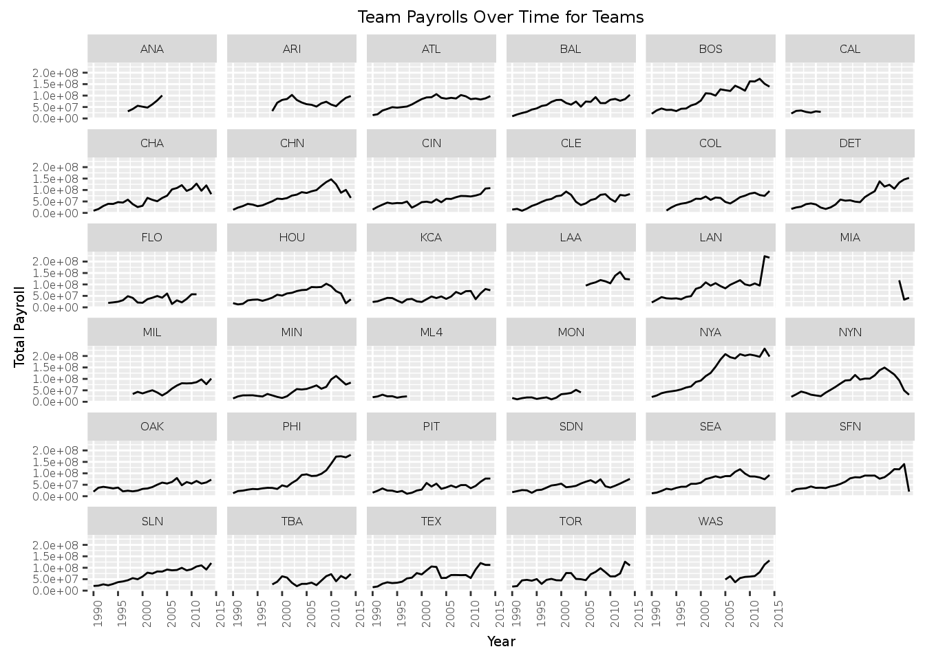
# Put all of these on one large plot
payroll_tab %>%
  filter(yearID >=1990 & yearID <= 2014) %>%
    ggplot(aes(x=yearID, y=payroll)) +
      geom_point() +
      geom_smooth() +
      xlab("Year") +
      ylab("Total Payroll") +
      ggtitle("Payrolls of Teams Over Time")
## `geom_smooth()` using method = 'loess'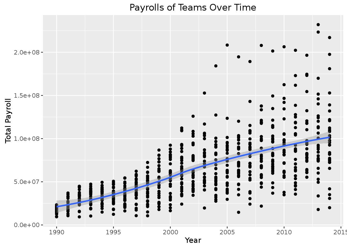 This first table produced many plots for each team. In each plot, we have the year in the x-axis and we show total payroll in the y-axis. The first plot is difficult to visualize and make a statement about the overall trend of all teams across many years so we try to combine all of the teams and their payrolls in one plot (the second plot above). As you can see from the first plot, some teams only have payroll information for some later (more recent) years. In the second plot, their are many points that appear in vertical lines because our dataset has data about payrolls of teams in discrete years.
Question 1. What statements can you make about the distribution of payrolls conditioned on time based on these plots? Remember you can make statements in terms of central tendency, spread, etc.
On average, it seems that the average payrolls of teams are increasing over time. We can also see that the spread of the payroll of the teams increases among the other teams through time as well. Some teams become much more wealthier than the others and the difference between the wealthies and poorest teams seems to be increasing. We shall explore this hypothesis and make some more plots to confirm it.
###Problem 3. Write code to produce plots that specifically show at least one of the statements you made in Question 1. For example, if you make a statement that there is a trend for payrolls to decrease over time, make a plot of a statistic for central tendency (e.g., mean payroll) vs. time to show that specficially.
# get the average payroll of all teams for each year
payroll_tab %>%
  group_by(yearID) %>%
    summarise(avg_payroll = mean(payroll)) %>%
      ggplot(aes(x=yearID, y=avg_payroll)) +
        geom_bar(stat = "identity") +
        xlab("Year") +
        ylab("Average Payroll of Baseball Teams") +
        ggtitle("Average Payroll of Baseball Teams over Time") +
        geom_smooth()
## `geom_smooth()` using method = 'loess'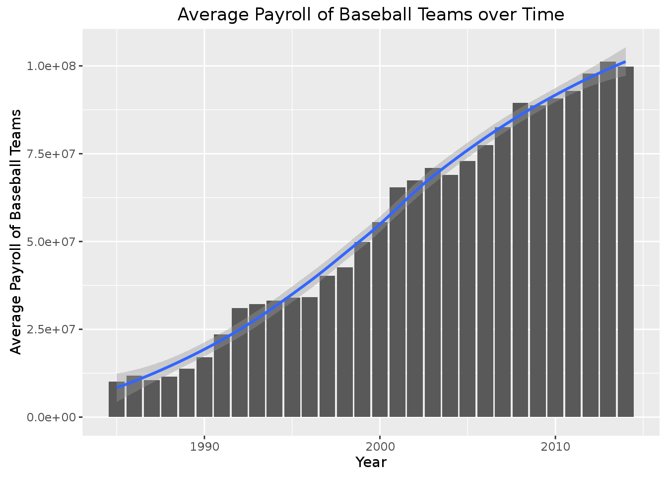 As we can see from the graph, the average payroll (central tendency) of baseball teams in a given year has almost always increased as time goes on. On average, a team payroll is more in an given year than from the year before.
Lets look have a look at the spread of payrolls between teams over the years. In other words, how is the pay gap between the richest and poorest baseball teams changing over time?
# plot showing the difference between the richest and the poorest teams throughout the years.
payroll_tab %>%
  group_by(yearID) %>%
  summarise(max_payroll = max(payroll), min_payroll = min(payroll)) %>%
    ggplot(aes(x = yearID, y = (max_payroll-min_payroll))) +
      geom_bar(stat = "identity") +
      xlab("Year") +
      ylab("Payroll Spread") +
      ggtitle("Difference in Payroll Between Wealthy and Poor Teams Over Time") +
      geom_smooth() +
      scale_x_continuous(breaks = scales::pretty_breaks(20)) +
      theme(text = element_text(),
            axis.text.x = element_text(angle=90, vjust=1))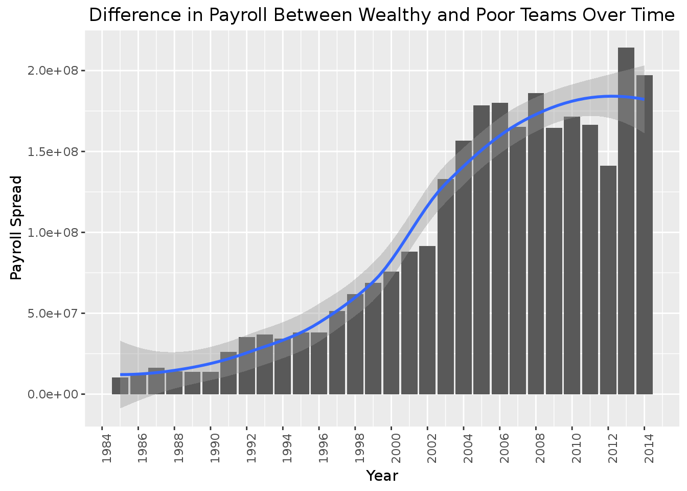
Interesting, it seems from our graph that the difference between the poorest and wealthiest teams seems to increase a lot, then decrease at around 2008/2009 until about 2013 where the payrolls begin to go up again. My guess would be that this has to do with the financial crisis in late 2008 that hit the US and world economy. The richest teams likely had to pay less to their players because the economy was doing poorly.
Correlation Between Payroll and Winning Percentage
###Problem 4. Write code to discretize year into five time periods (using the cut function with parameter breaks=5) and then make a scatterplot showing mean winning percentage (y-axis) vs. mean payroll (x-axis) for each of the five time periods. You could add a regression line (using geom_smooth(method=lm)) in each scatter plot to ease interpretation.
# add a year range variable
payroll_tab$year_range <- cut(payroll_tab$yearID, breaks=5)

# take a look
payroll_tab %>% sample_n(10) %>% select(teamID, yearID,year_range)
## # A tibble: 10 × 3
## teamID yearID year_range
## <chr> <int> <fctr>
## 1 CLE 1995 (1991,1997]
## 2 MIN 2012 (2008,2014]
## 3 TBA 2001 (1997,2002]
## 4 SEA 1998 (1997,2002]
## 5 NYN 2010 (2008,2014]
## 6 BOS 1998 (1997,2002]
## 7 CAL 1986 (1985,1991]
## 8 CLE 1997 (1997,2002]
## 9 BAL 2010 (2008,2014]
## 10 BOS 1995 (1991,1997]# make table of each team in the year_range and their average paroll and average win_percentage
avg_stats_per_year <- payroll_tab %>%
group_by(year_range,teamID) %>%
summarise(average_pay_in_years = mean(payroll),
average_win_percent_in_years = mean(win_percentage, na.rm=TRUE))
# take a look at this table
head(avg_stats_per_year)## Source: local data frame [6 x 4]
## Groups: year_range [1]
##
## year_range teamID average_pay_in_years average_win_percent_in_years
## <fctr> <chr> <dbl> <dbl>
## 1 (1985,1991] ATL 14475059 40.22038
## 2 (1985,1991] BAL 11658262 45.40360
## 3 (1985,1991] BOS 14563356 52.89024
## 4 (1985,1991] CAL 15077312 51.74897
## 5 (1985,1991] CHA 9008958 48.18396
## 6 (1985,1991] CHN 13605046 48.44389# plot the teams average payroll and win_percentage faceted on the year_range
avg_stats_per_year %>%
ggplot(aes(x=average_pay_in_years, y=average_win_percent_in_years, label=teamID)) +
geom_point() +
geom_text() +
facet_wrap(~year_range) +
xlab("Average Team Payroll") +
ylab("Average Winning Percentage") +
ggtitle("Average Winning Percentage vs. Average Payroll across Time") +
geom_smooth(method = 'lm') +
theme(text = element_text(),
axis.text.x = element_text(angle=90, vjust=1))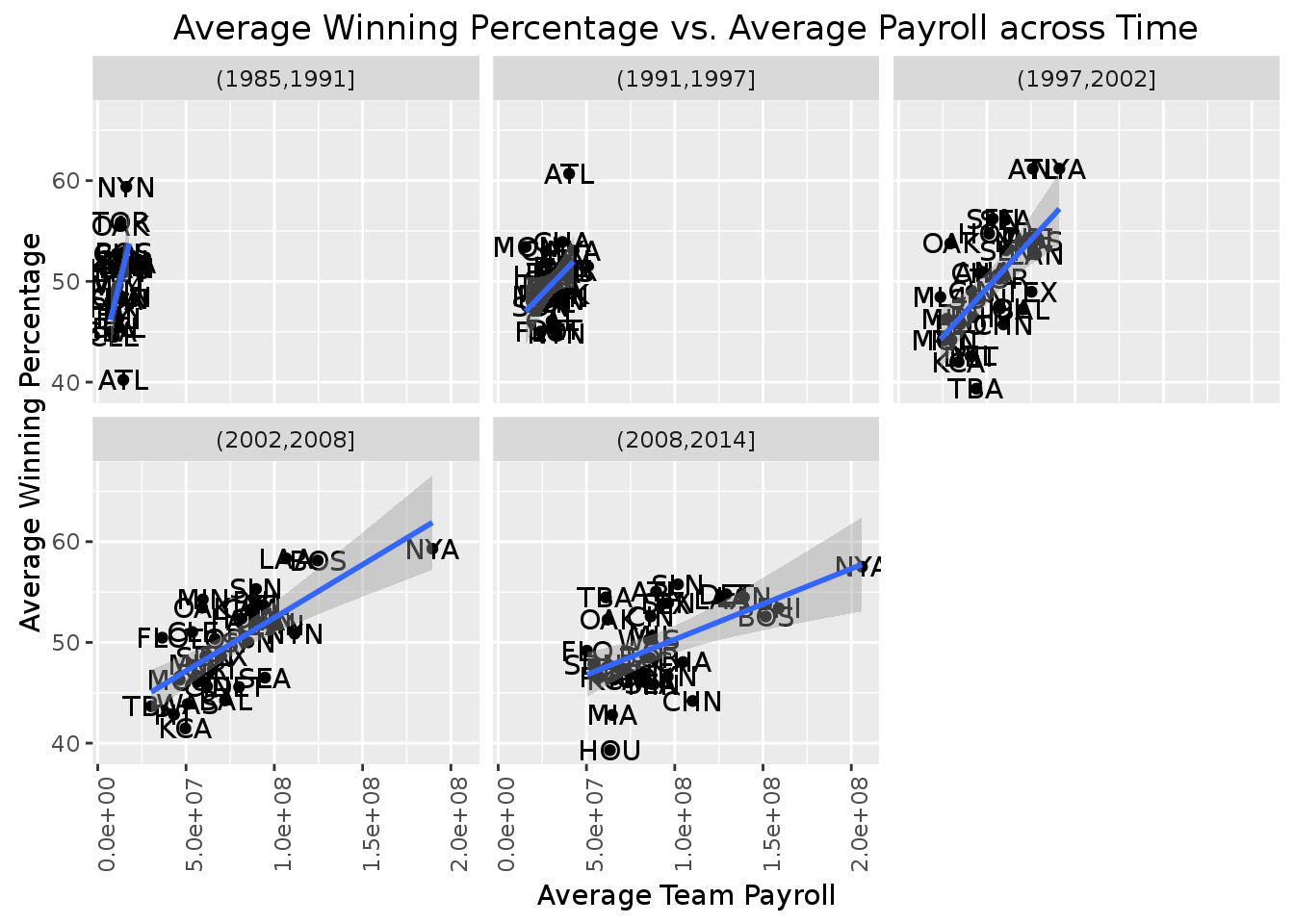 In the first line of code, we created a new variable that discretized our
 yearID variable into a range. As you can see, this made it so we can split up teams (with their year) into a total of 5 different factor levels. We then made a table (avg_stats_per_year) which grouped the teams into their year ranges and calculated new attributes for the average payroll and average winning percentage of those teams in a specific year range. Finally, we plotted the results into 5 plots to show the distribution of the average payrolls of teams in different time periods.
###Question 2. What can you say about team payrolls across these periods? Are there any teams that standout as being particularly good at paying for wins across these time periods? What can you say about the Oakland A’s spending efficiency across these time periods (labeling points in the scatterplot can help interpretation).
As we can see from these scatter plots, it appears that on average, the spread of the average payroll increases as more teams are paying their players more and more as time goes on. Also, we see that our regression line goes from being vertical to diagonal over time, signaling that spending more money on players is more likely to result in a team winning more games. Apart from the period of 1991 to 1997, it seems that NYA have always seem to have, on average, the highest payroll and that has worked out quiet nicely for them as they are able to keep the highest winning percentage, perhaps because of that.
Lets try to see how Oakland A’s have been doing by highlighting them red.
avg_stats_per_year %>%
  ggplot(aes(x=average_pay_in_years, y=average_win_percent_in_years)) +
    geom_point(aes(colour=ifelse(teamID=="OAK", 'Oakland As', "Other Teams"))) +
    facet_wrap(~year_range) +
    xlab("Average Team Payroll") +
    ylab("Average Winning Percentage") +
    ggtitle("Oakland A's Spending Efficency Over Time") +
    geom_smooth(method = 'lm') +
    labs(colour="Team") +
    theme(text = element_text(),
      axis.text.x = element_text(angle=90, vjust=1))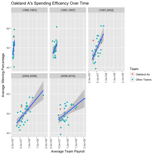
As you can see from the plots, the Oakland A’s started off like any other team from 1985 until 1997. In 1997 to 2002, the Oakland A’s were doing significantly better than their counterparts who were spending the same amount of money as them (i.e. they were winning more for less payroll). This trend continued until 2014, but as teams keep spending more money, they can not be as high, relatively to others due to the strong effect of money in winning (although they are still high in average winning compared to any team that spent as little as they did.)
Data Transformations
Standardization across years
It looks like comparing payrolls across years is problematic so let’s do a transformation that will help with these comparisons.
###Problem 5. Write dplyr code to create a new variable in your dataset that standardizes payroll conditioned on year.
# a table of year and the average and standard deviation for payrolls of teams
standard_payrolls <- payroll_tab %>%
              group_by(yearID) %>%
              summarise(average_payroll_year = mean(payroll),st_dev_payroll_year = sd(payroll))

# take a look
head(standard_payrolls)
## # A tibble: 6 × 3
## yearID average_payroll_year st_dev_payroll_year
## <int> <dbl> <dbl>
## 1 1985 10075565 2470845
## 2 1986 11840558 3186956
## 3 1987 10483668 3848337
## 4 1988 11555862 3386331
## 5 1989 13845989 3568844
## 6 1990 17072354 3771834# join this with our original payroll_tab
payroll_tab <- payroll_tab %>% inner_join(standard_payrolls, by=c("yearID"))
# take a look at the joined table
payroll_tab %>%
select(teamID, yearID, average_payroll_year, st_dev_payroll_year) %>%
sample_n(5)## # A tibble: 5 × 4
## teamID yearID average_payroll_year st_dev_payroll_year
## <chr> <int> <dbl> <dbl>
## 1 TOR 1991 23578785 6894669
## 2 DET 1991 23578785 6894669
## 3 SEA 2008 89495289 37802001
## 4 NYA 1996 34177984 10688535
## 5 BAL 1985 10075565 2470845# create a standard payroll for each team of each year
payroll_tab <- payroll_tab %>%
mutate(standard_payroll = (payroll-average_payroll_year)/st_dev_payroll_year)We created a new table standard_payroll and grouped teams from our payroll team by the yearID. We then made 2 attributes, average_payroll_year and st_dev_payroll_year which is the average payroll of all teams in a specific year and the standard deviation of payrolls of all teams in a specific year. We then did an inner join with our original payroll_tab so that we could have each team’s payroll as well as the average (and standard deviation) payroll of other teams in that same year. The last line of code calculates a z-score (standard_payroll) for each team based on their payroll, average_payroll_year, and st_dev_payroll_year.
###Problem 6. Repeat the same plots as Problem 4, but use this new standardized payroll variable.
# plot the teams average payroll and win_percentage faceted on the year ranges
payroll_tab %>%
group_by(year_range,teamID) %>%
summarise(average_pay_in_years = mean(standard_payroll),
average_win_percent_in_years = mean(win_percentage, na.rm=TRUE)) %>%
ggplot(aes(x=average_pay_in_years, y=average_win_percent_in_years, label=teamID)) +
geom_point() +
geom_text() +
facet_wrap(~year_range) +
xlab("Average Standard Team Payroll") +
ylab("Average Winning Percentage") +
ggtitle("Average Winning Percentage vs. Average Standard Payroll across Time") +
geom_smooth(method = 'lm')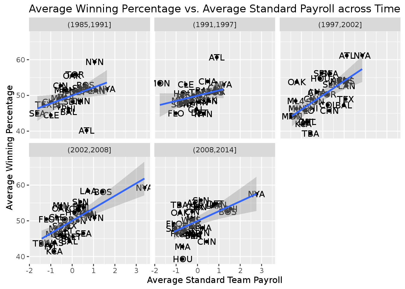 In the above code block, we again group the teams in the
 payroll_tab by their year_range and teamID and plot based on the average standard payrolls and the average win percentage based on the group by clause.
###Question 3. Discuss how the plots from Problem 4 and Problem 6 reflect the transformation you did on the payroll variable. These new plot represents the transformation because we can now see how each data point is relative to each other on a standard scale. We normalized the points according to their payroll so that the mean payroll is now centered at 0 and the standard deviation is now 1. This way we can see that if a data point (team in a specific time period) is above zero payroll (i.e. above average), it will result in Y winning percentage. In the plots from problem 4, all of the teams (plots in year ranges) had a different center (mean payroll) and standard deviation, which made it difficult to compare the plots of different time periods. Having this standardized transformation makes it easy to compare the points because they are all on the same normal scale.
Expected wins
It’s hard to see global trends across time periods using these multiple plots, but now that we have standardized payrolls across time, we can look at a single plot showing correlation between winning percentage and payroll across time.
###Problem 7. Make a single scatter plot of winning percentage (y-axis) vs. standardized payroll (x-axis). Add a regression line to highlight the relationship (again using geom_smooth(method=lm)).
payroll_tab %>%
  ggplot(aes(x=standard_payroll, y=win_percentage, label=teamID)) +
    geom_point(aes(colour=Rank)) +
    xlab("Standard Team Payroll") +
    ylab("Winning Percentage") +
    ggtitle("Winning Percentage vs. Standard Payroll across Time") +
    geom_smooth(method = 'lm') +
    labs(colour = "Rank") +
    scale_colour_gradient(low="green", high="red")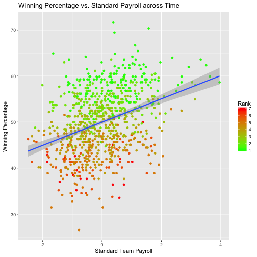
In this plot, the lighter colors represent teams of lowers ranks where as the darker colors represent the higher ranked teams. As you can see, when we plot all of these teams and look at the regression line for the average payroll (mu = 0), we see that if a team where to spend the average amount of payroll relative to the other teams in the league, they would likely (on average) win about 50% of their games.
Spending Efficiency
Using this result, we can now create a single plot that makes it easier to compare teams efficiency. The idea is to create a new measurement unit for each team based on their winning percentage and their expected winning percentage that we can plot across time summarizing how efficient each team is in their spending.
Problem 8
** Write dplyr code to calculate spending efficiency for each team for team ii in year jj, where expected_win_pct is given as expected_win_pct = 50 + 2.5 * standard_payroll). Make a line plot with year on the x-axis and efficiency on the y-axis. A good set of teams to plot are Oakland, The New York Yankees, Boston, Atlanta and Tampa Bay (teamIDs OAK, BOS, NYA, ATL, TBA). That plot can be hard to read since there is so much year to year variation for each team. One way to improve it is to use geom_smooth instead of geom_line. **
# calculate the expected_win_pct
payroll_tab <- payroll_tab %>% mutate(expected_win_pct = (50+2.5*standard_payroll))

# lets see how close this is to actual win_pct
head(payroll_tab %>% select(teamID, yearID,win_percentage, expected_win_pct))
## # A tibble: 6 × 4
## teamID yearID win_percentage expected_win_pct
## <chr> <int> <dbl> <dbl>
## 1 ATL 1985 40.74074 54.78726
## 2 BAL 1985 51.55280 51.50267
## 3 BOS 1985 49.69325 50.83169
## 4 CAL 1985 55.55556 54.40368
## 5 CHA 1985 52.14724 49.76791
## 6 CHN 1985 47.53086 52.65835# lets now calculate the efficiency
payroll_tab <- payroll_tab %>% mutate(efficiency = win_percentage-expected_win_pct)
# Overall efficiency of
payroll_tab %>%
filter(teamID %in% c("OAK", "BOS", "NYA", "ATL", "TBA")) %>%
ggplot(aes(x=yearID, y=efficiency)) +
geom_smooth() +
geom_point(aes(colour=teamID)) +
xlab("Year") +
ylab("Winning Efficiency") +
ggtitle("Efficiency of Teams (Overall) Over Time") +
labs(colour="Team")## `geom_smooth()` using method = 'loess'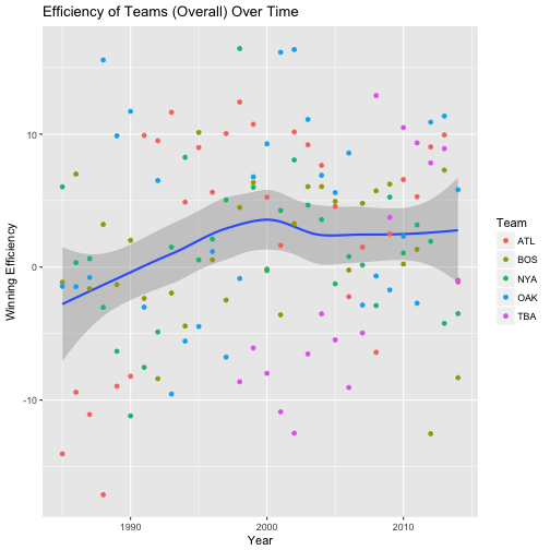
# The Effieciency of the individual teams as shown through a smooth line
payroll_tab %>%
  filter(teamID %in% c("OAK", "BOS", "NYA", "ATL", "TBA")) %>%
    ggplot(aes(x=yearID, y=efficiency, color = teamID)) +
      geom_smooth() +
      xlab("Year") +
      ylab("Winning Efficiency") +
      ggtitle("Efficiency of Specific Teams Over Time") +
      labs(colour="Team")
## `geom_smooth()` using method = 'loess'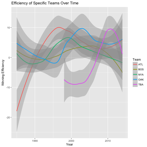 In this code above, we calculate the expected winning percentage of a team as 50 + 2.5 * the standard payroll. We derived this from our regression line in problem 7. We next calculated the “efficiency” of a team. We define the efficiency of a team as their winning percentage minus their expected winning percentage. In other words, our regression line tells us that on average, how much a team should be winning based off of how much money they spend on their players (their payroll). If a team is winning more games that what is expected (expectation is based off of data on all teams and off all years), then we say that that team is particularly efficient at winning. This is because they win more than what we would think they would. We plot this data in the first graph above to see the average efficiency of 5 teams OAK, BOS, NYA, ATL, and TBA. We see that after 1990, these teams were always “efficient.” This probably has to do with the fact that other factors lead to their success as well as money such as coaching and resources. In the second plot, we plotted the smooth regression line for these 5 individual teams to see how their efficiency has changed over time. As you can see, some teams used to be more efficient than others and some others have changed many times over time.
Question 4.
What can you learn from this plot compared to the set of plots you looked at in Question 2 and 3? How good was Oakland’s efficiency during the Moneyball period?
From this set of plots we can learn why the Oakland A’s were a truely smart team and ahead of their time. As we can see from the first graph ploted above (from problem 8), “winning efficienct of teams over time seemed to increase to an all time high in 2000 and then plateaued after 2005 (for these 5 good teams). In question 2 and question 3 we learned that over time, money seemed to have a high level of influence on how well a team would do. In particular, as time went by, the regression line of payroll and winning percentage of teams emmerged and we came to the conclusion in our regression line of all teams across all years (see problem 7) that a team is predicted to win more than half (50%) of their games if they spend more than average amount of payroll for their teams. Oakland is considered an interesting team because they are an outlier to this trend. At least in their money ball period, if we look at the time period from 2000 to 2005, we see that Oakland became more efficient than any other team (with a significant growth coming from 1995 to 2000). This means that they were able to outperform in their games won (winning percentage) based off of their team payrolls. Based off of what they were paying, they were winning way more games than expected.
Conclusion
I hope that this module was interesting to follow, it certainly was interesting for me to explore. It turns out that although money does seem to be a good predictor of a winning team now a days, their are still tricks that teams, such as Oakland, were able to use to beat the system.

Yusuf Ameri
Learning Since 1997